Final Poster Designs (week29)
Team robot has worked very successfully as a machine that is greater than the sum of it's parts. We have seen many different colourschemes/layouts and concepts for the look of the website and the posters cycle through, and through each iteration we have blended everyones strongest ideas to create something that is definitely a group design rather than one persons vision.
Often I have suggested an initial concept in a group meeting, and sketched it out roughly using readily available clip art, but this has then been enhanced and embellished further by B and R as the skilled graphic artists and software practitioners, evolving along the way as they developed logo's and backgrounds to create a cohesive style.
M has kept us on track with making sure the information is clear, as English is her second language and she also comes from industry, her priorities for legible typefaces and clear headings has been invaluable for keeping us coming back to the purpose of the project.
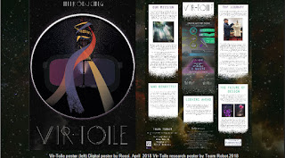
This shows the progression from my initial rough layout (left) through scribbled layout concepts drawn on a printout during a team meeting, to B's first paste up using her own created starfield and the disintegration of the blocks to match our team photo, and finally with the addition of R's info graphic and his insertion of the photographs and QR code and a final polish of colours and creation of the "marketing poster" to match the research one. As can be seen, an iterative process really worked for us as a creative team, playing to everyones strengths and getting maximum creativity on board.
From initial thoughts of sciFi poster neon blue and calico, through crisp shaped linear greens - the end result is very different to that which each of us might have designed solo, but I think it is better.


Comments
Post a Comment